Samsung's One UI 8.5 Leaks: Embracing a 3D Icon Design, A Nod to the Past?
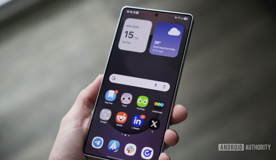
As someone who's been following mobile tech for years, I'm always keen to see how manufacturers evolve their design language. Samsung's One UI is getting a makeover in its upcoming 8.5 version, and it looks like the **app icons are going 3D**. It's a pretty big departure from the flat design we've become accustomed to.
What's interesting is how this shift mirrors some of the design choices we've seen from Apple. With iOS, they've also embraced a more 3D-like appearance for icons. You can see how the different menu options appear slightly raised, giving the whole interface a bit more depth. A drop shadow behind the icons reinforces this effect.
Samsung isn't just applying this change to its own system apps. It looks like they're extending the 3D treatment to other popular apps like YouTube and the Google Play Store. I think it shows commitment from Samsung to maintain a consistent look and feel across the entire user experience.
However, this isn't entirely new territory for Samsung. If you remember Touchwiz, some of those older versions had a similar 3D aesthetic. The good news is that the new icons should be more refined than earlier and complement the modern UI.
While the new look is interesting, there are some concerns. According to reports, the new 3D rendering can impact battery life. It's something Samsung will need to address before the final release of One UI 8.5. I think that optimizing performance should be a top priority.
Source: AndroidAuthority