iOS 26 Liquid Glass: A Deep Dive into Apple's Translucent New Design
Apple's latest iOS 26 update has arrived, and the most noticeable thing is the Liquid Glass design. It's a major shift, the biggest since iOS 7 landed way back in 2013. While there are new features, it's clear Apple focused heavily on giving the interface a visual overhaul. It’s not just iPhones, as iPadOS 26 and macOS Tahoe are also getting the Liquid Glass treatment.
So, what exactly is Liquid Glass? Well, imagine your iPhone's interface elements – buttons, menus, and so on – are made of translucent glass. Light and color filter through, giving everything a subtle, layered look. When you move your phone, you should notice light reflecting off these "glass" surfaces. It's a pretty cool effect when you first see it. App icons also get this layered treatment, giving them a bit of depth. For example, the Messages, Weather, Photos, and Maps apps have a design where the icon appears on top of a background color, giving you a subtle 3D illusion.
The Lock Screen gets a Liquid Glass makeover too. You'll see translucent Control Center buttons (which you can still customize), the option for a Liquid Glass clock design, and notifications that have a frosted glass look. The clock is particularly interesting because it blends more seamlessly with your wallpaper. If you're using a photo, the time adjusts its size to fit the available space on the screen. Widgets on the Lock Screen also get the Liquid Glass treatment, with the time and Control Center buttons reflecting light as you move your iPhone.
However, it hasn't been a smooth ride. In the early beta versions of iOS 26, the Control Center was so translucent that it was almost impossible to read. Apple has since made the buttons darker and more opaque to improve usability. It's a constant balancing act between aesthetics and functionality, and Apple's been tweaking the design with each beta release.
In apps, you'll notice Liquid Glass in menu bars, navigation bars, and buttons. Most of Apple's own apps have been updated with this design. The goal is to make navigation bars and menus look like they're floating over the content, creating a layered effect.
What do I think? It's a bold move by Apple. The Liquid Glass design definitely makes iOS 26 stand out. However, I can see why some people aren't fans. Too much translucency can make things hard to read. It's a matter of personal preference. For instance, navigation bars in apps are translucent, allowing you to see some of the app's background behind them, especially when scrolling, but are they too transparent?
Ultimately, Liquid Glass is a significant design change that aims to bring a fresh, modern look to iOS, iPadOS, macOS, watchOS and tvOS. Whether you love it or hate it, it's hard to deny that it makes a statement. It’ll be interesting to see how Apple continues to refine the design based on user feedback.
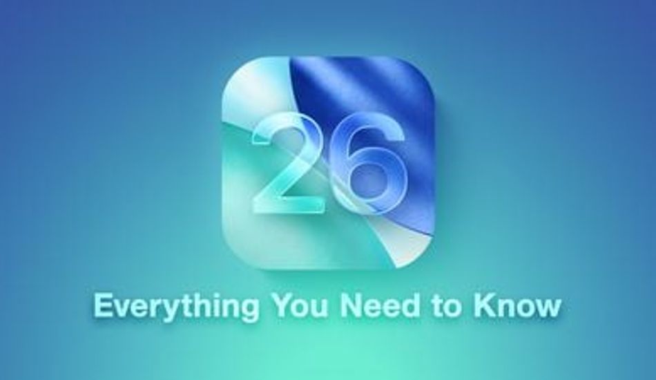
1 Image of iOS 26:


Source: Mac Rumors