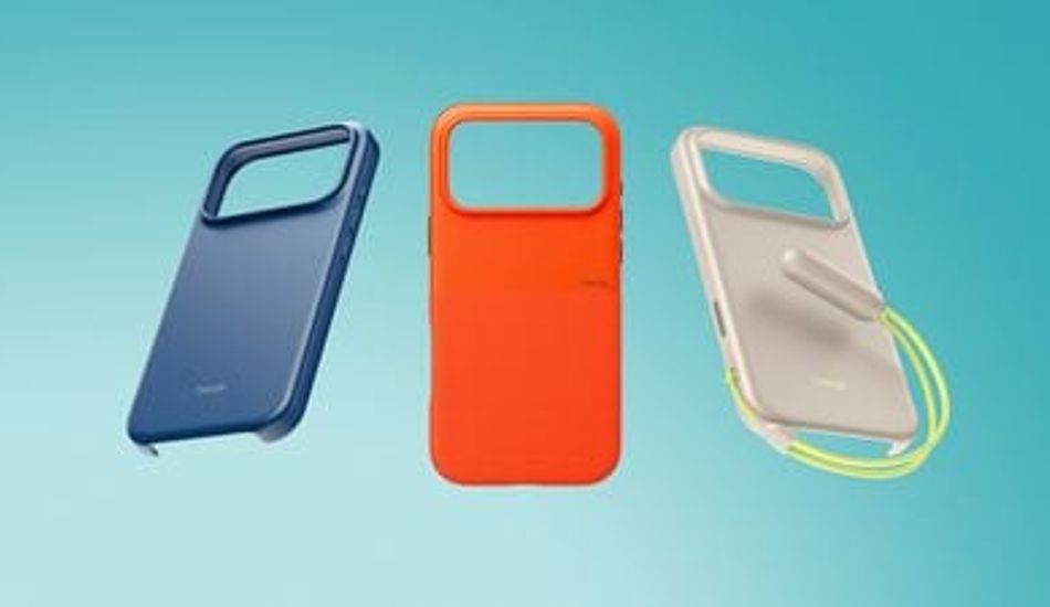
iOS 26: App Icons Tinted to Match Your iPhone Case Color
So, I've been playing around with the new iOS 26, and there's this nifty feature that lets you customize your app icons in a way that’s, well, kind of cool. Apple's really leaning into personalization, and this update is a testament to that. What they've done is allowed the system to pull the color from your official Apple MagSafe case (the ones with the NFC chip inside) and apply it as a tint to all your app icons. It's a subtle touch, but it can really tie the look of your phone together.
I remember when iOS 18 introduced the concept of tinted app icons. It was a decent start, giving a basic color filter. However, now, with iOS 26, it’s gotten way more sophisticated. It’s not just a filter; the system intelligently adjusts the brightness, saturation, and contrast to make sure everything remains readable. Think of it like Instagram filters, but for your entire home screen. If you don't have the official case, don't worry; you can still tint your app icons to match your iPhone's color!
One thing I noticed right away is how the Light and Dark Modes handle the tint differently. In Light Mode, the icons take on the full color you choose, with the graphics turning white. It's vibrant and eye-catching. However, in Dark Mode, the backgrounds become a much darker shade of your chosen color. It's not entirely black, but it provides a nice contrast that doesn't strain your eyes in low-light conditions. I appreciate the attention to detail here; it shows that Apple is thinking about the user experience in various scenarios.
1 Image of iOS 26:


Source: Mac Rumors