Android Settings to Get a Colorful Makeover in Future Updates
Google is poised to introduce a more expressive Material Design theme, potentially at the upcoming Google I/O developer conference. While details remain sparse, recent Android beta releases offer glimpses into this updated framework, suggesting that colorful icons may become a key element of Google's design evolution.
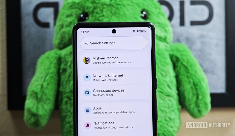
The Android 16 Beta 4 introduces updates to the Settings app, showcasing a redesign with new colorful icons. The Settings homepage, the initial screen upon opening the app, now features these vibrant icons for each entry. This marks a departure from the current design, which employs simple gray, borderless icons positioned to the left of the text.
In the redesigned version, these icons are encased within circles of varying colors, introducing a visually engaging element to the page. The shift represents a move towards a more dynamic and expressive user interface within the Android ecosystem.
One exception to the colorful icon update is the 'Digital Wellbeing & parental controls' entry. This retains its gray icon, as it is sourced from the separate Digital Wellbeing app, rather than the Settings app. This discrepancy highlights the fact that Google still needs to do some work before releasing the expressive redesign.
Given the inconsistencies and ongoing development, the new design, including the colorful icons, is unlikely to feature in the initial stable release of Android 16. Instead, the updated Settings appearance will likely debut in a subsequent Android 16 quarterly release, or potentially be deferred until Android 17.
The specific color schemes and iconography are subject to change before the official rollout. Currently, there is no discernible pattern governing the color selection for each icon's background, although related entries appear to share similar colors. The final implementation may incorporate a more cohesive and intuitive color palette.
Source: AndroidAuthority